Hey coconuts! Last y’all heard, I’d just finished creating a comic book centered around my journey with Whole30. After the comic, I really plunged into creating artwork for my third book, ABC Adventures. The sketches are all approved, and I’m now about 1/3 finished with painting, hoping to be finished by Halloween! The bummer is that I can’t really post images from the book until AFTER it’s released, but you’ll just have to trust that they’re adorable.
I CAN share another piece I created for the SCBWI (Society of Children’s Book Writers & Illustrators) conference from this past Sunday, September 24. I had an illustrator intensive with Jess Tice-Gilbert, a senior art director at Scholastic. Jess had us all pick fairy tales to illustrate, submit sketches to her, and bring a final illustration to the conference for a critique.
To be honest, I’m not a fan of illustrating fairy tales. I’m sick of them. But I found this super weird one called Mrs. Fox’s Wedding. Essentially, there’s a married couple, and “old Mr. Fox” plays dead to see if his wife will remain faithful. Instead, she starts inviting suitors to the house to pick a new husband. The first suitor has one tail and she’s like, “Nah.” The second fox has two tails and she’s like, “Still nope.” The third fox has three tails and…well, you get the picture. Finally, a fox shows up with nine tails and she’s all about it. They get married. From what I read on the internets, there are two endings: in the more Grimm-like, the old Mr. Fox wakes up and kills everybody in a jealous rage. I chose the second ending where everyone dances and never stops. Nice!
Aaand BEHOLD, MRS FOX’S WEDDING!
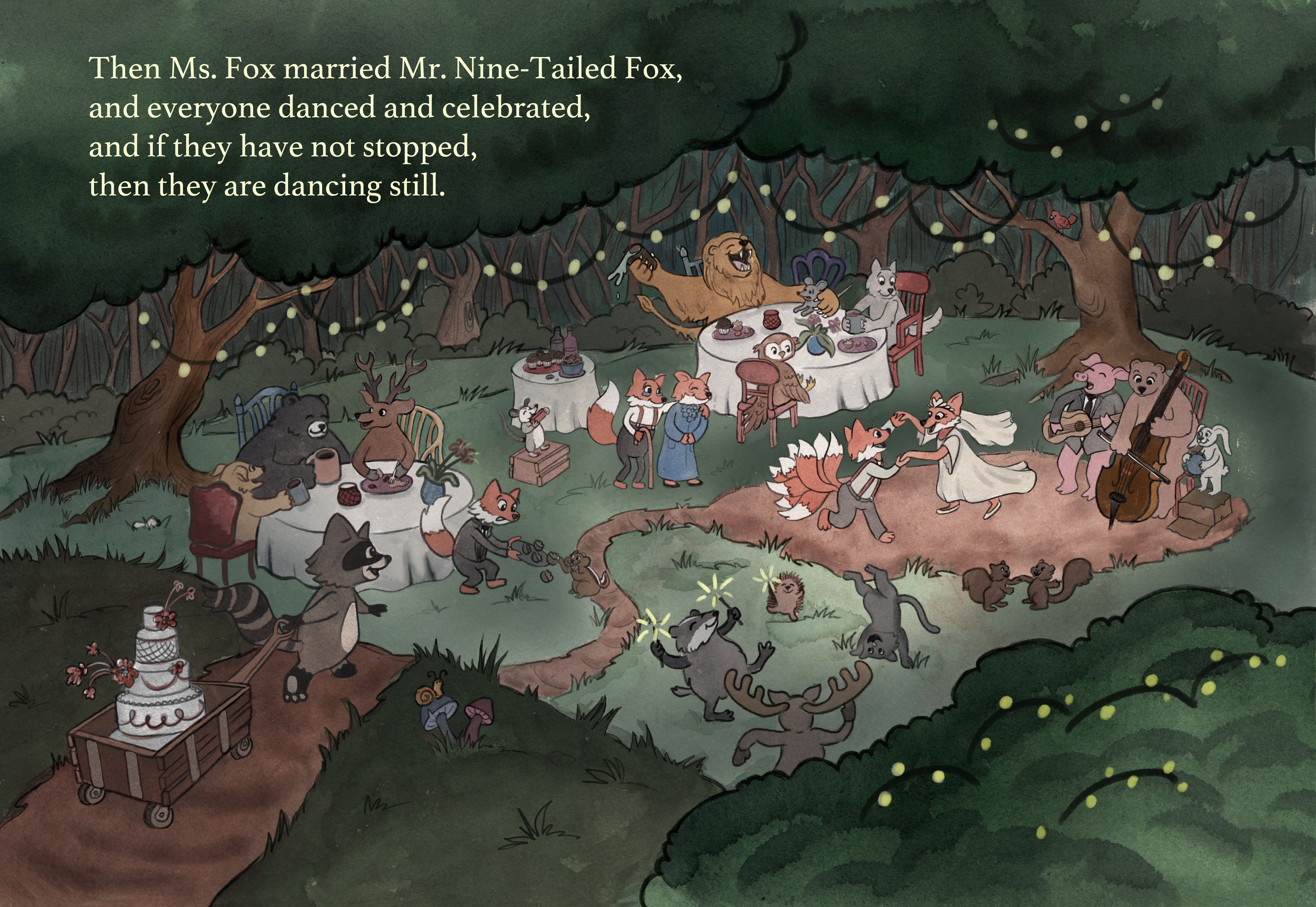
Okay, this piece was a blast, except for when we experienced a power surge and I lost three hours of work. I struggle with environments and lighting, so I challenged myself to create a strong environment with a clear background, middle-ground, and foreground. I also wanted strong/dramatic lighting to really showcase the focal points. I am super pleased with the end result and I think it showcases how far I have come as an illustrator! It was very gratifying to receive positive feedback from other illustrators I’ve known for 4-5 years, because they could attest to the improvements I have made since I began.
On Friday, I’m visiting my daughter’s Kindergarten class to demo how an illustrator works to create a picture book. So, I thought it would be fun to show everybody on my blog, too — how an illustration is born, beginning to end. Personally, I love seeing other artist’s processes and learning new ways to do things. There were some “newbies” at the conference that had a lot of questions about process, and I think it can be heartening to see that these final illustrations aren’t just birthed from thin air, but instead go through lots of ugly, garbage stages where you doubt your skills completely. So here’s my process!
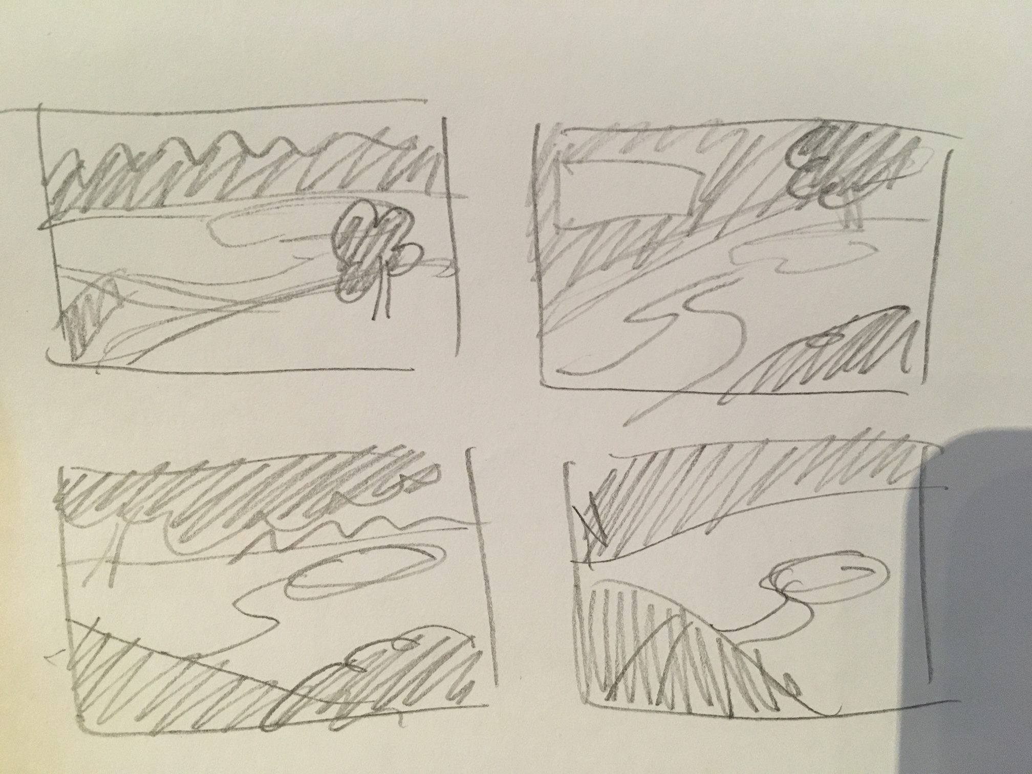
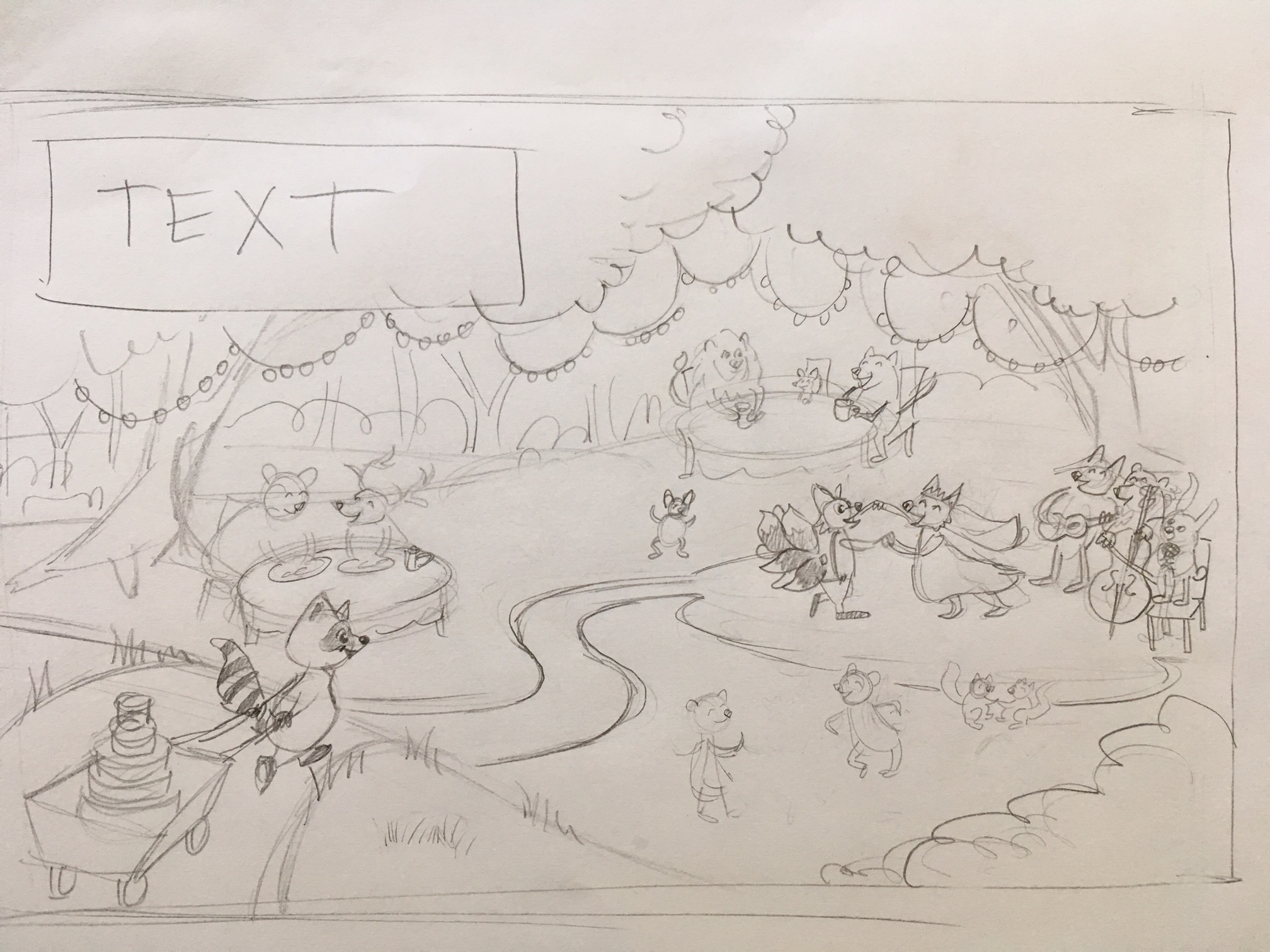
First of all, I picked a story. In this case, I knew I wanted a fox wedding in the middle of the forest, with tons of guests frolicking around, string lights, and somebody in the foreground approaching the party. That’s all I knew! So I began by sketching out tons of different thumbnails, playing with the composition and camera angle. I work tiny (like, 1” x 2”) so I’m forced to just work with large shapes and blocks of value. If I worked any larger, I would start putting in details. Details come LAST!
Then, I picked a few that I liked and started to sketch in environment stuff like where the road went, the dance floor, and the tree lines. I did this with slightly larger thumbnails, like maybe 2” x 3”. I started to think about where the text would be placed. I used a soft pencil for this, like a 4B, so I got nice thick lines and avoided that temptation to put in details. (I don’t have a photo of this step, sorry!)
Next, I picked my favorite and blew it up (I scanned it into my computer, enlarged it in Photoshop, and printed). Then I started to sketch the main characters loosely, mainly focusing on their body language and lines of action. I blocked out areas of interest (like vague groups of dancing animals) and tried not to add details still (like that it’s specifically a cat doing a hand stand). At this point, I had no idea how many animals would be added, or what they’d be doing. Next, I sent these very rough sketches to some illustrator friends and got feedback. They basically told me to add way more animals and give Mr. Fox more movement in his pose.
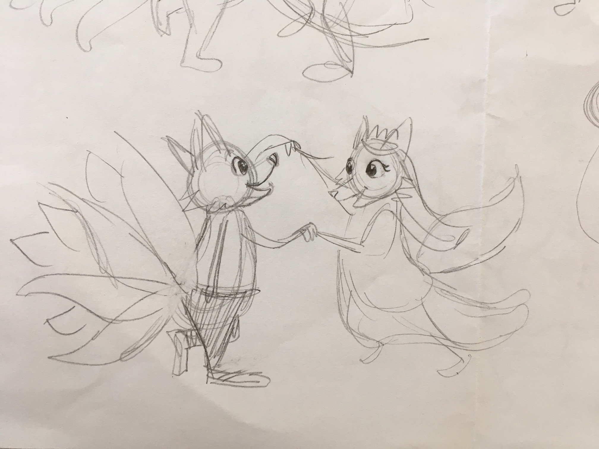
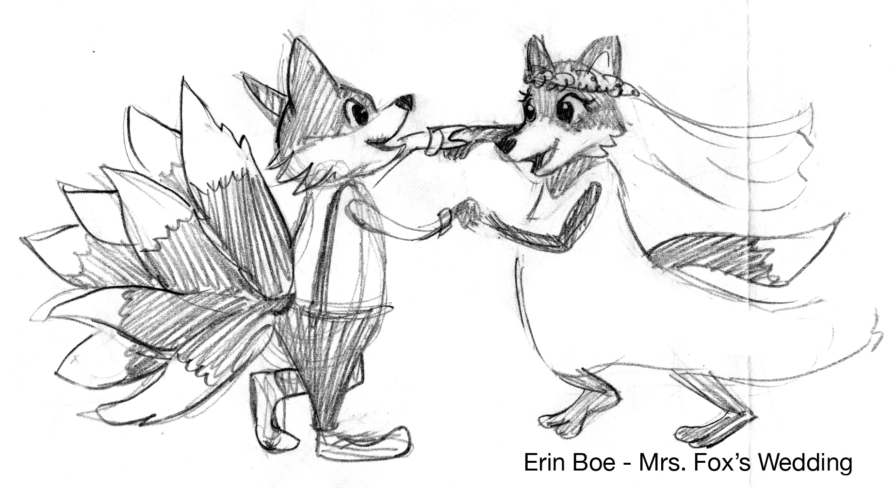
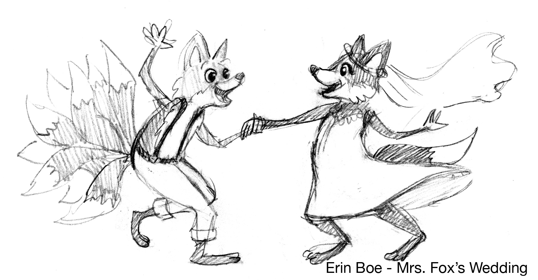
Next, I popped that baby into Photoshop and did a very rough value study. This helped me determine where the lighting would fall. My main focal point is the dancing couple, so I gave them some high contrast so they’d pop. I also wanted the scene to feel really cozy, so I framed it in darker trees. I sent this to the art director, along with my character sketches, and received some feedback — mainly to make sure the foxes didn’t look too Disney-esque, like “Maid Marian and Robin Hood.” But mostly, she had only positive feedback, which was great!
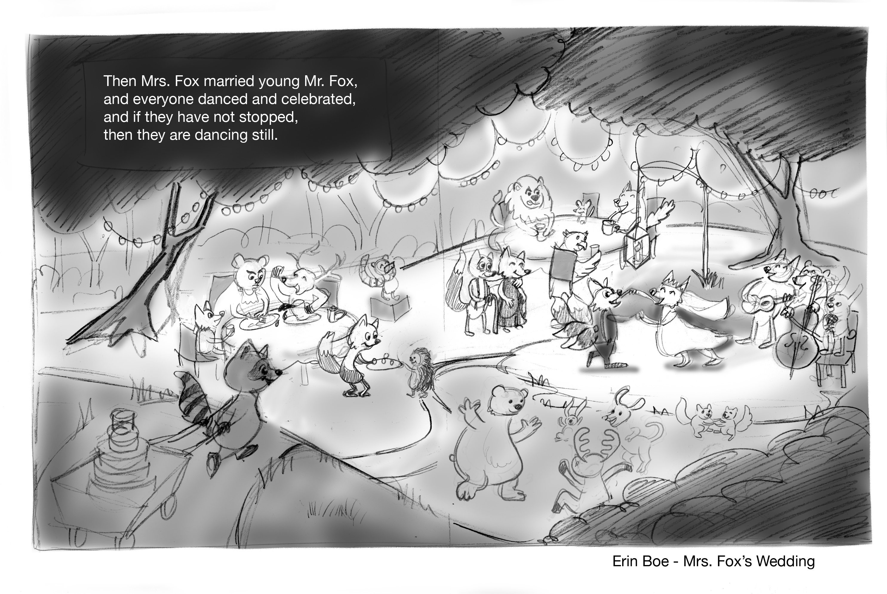
Then…I procrastinated. A lot. I had an entire month to work on the piece, but I waited until FOUR DAYS before the conference, because I’m an idiot. This was a piece that needed a lot of detail – there are like, 20 characters in there, and they each needed a unique pose and facial expression. Anyway, the next step was finalizing the sketch completely with details. And nobody can recall a badger from memory so I did a LOT of Google image searches for photo reference, every step of the way! (Side note: I love looking at my internet search history after finishing a sketch because it’s always like “cat handstand” and “pissed off monkey face.”)
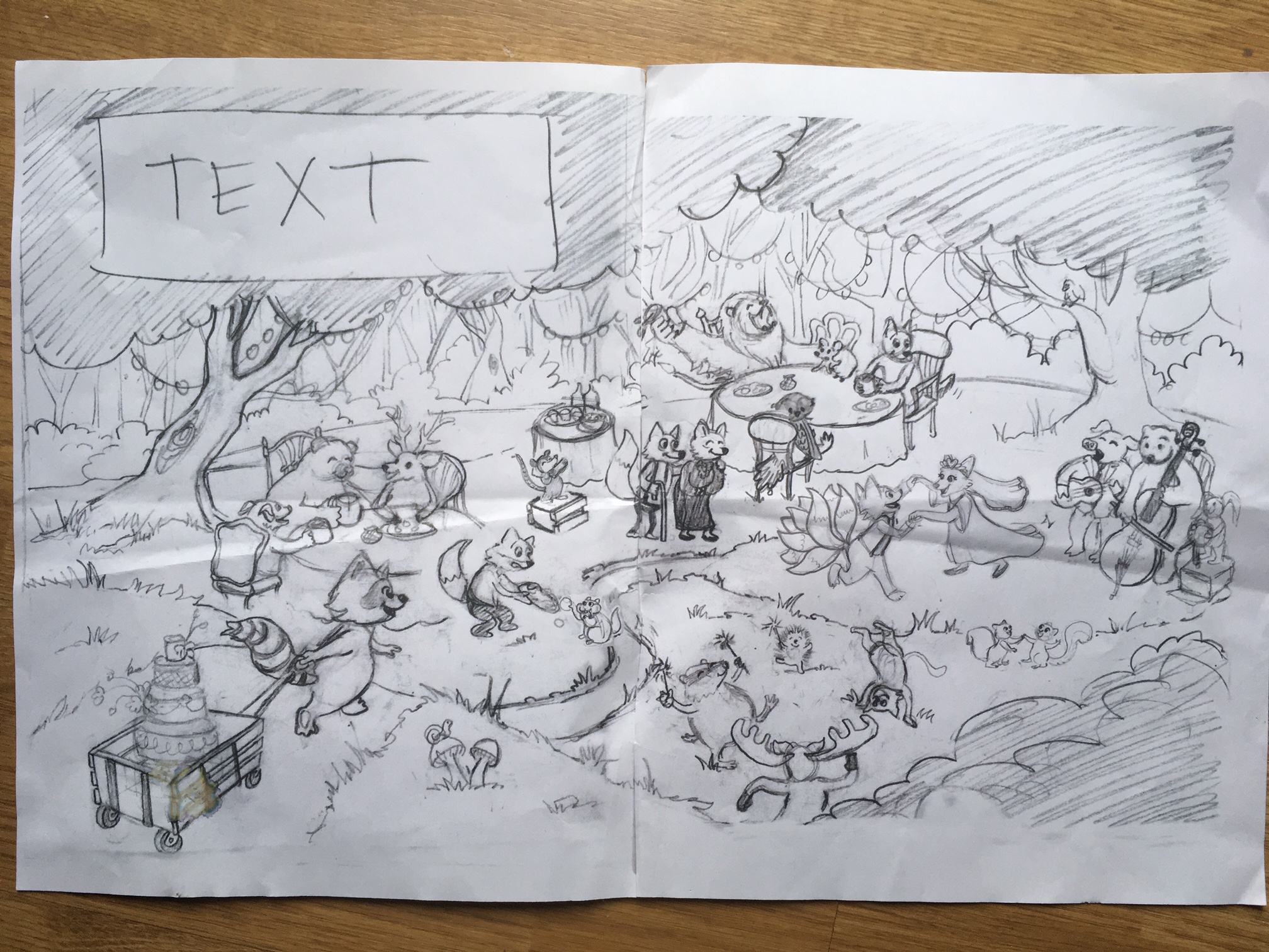
When my sketch was completely finished, I transferred it to watercolor paper. I did this using my industrial sized light table! Basically it’s a table that emits light, so you put your sketch underneath the watercolor paper and can see your sketch and trace it. Then I painted! And guess what? I’m the sloppiest painter in the world. I mean, I create pure garbage when I’m painting. But, I don’t care. Essentially, this step is just to put the TEXTURE of a watercolor brush down on paper. I didn’t really care about color at this point, or tone or lighting. I’m kind of backwards that way, and I should probably learn how to actually paint, but I guess I don’t like the extreme likelihood of messing up a painting. So I just slap paint and water on there so that my final illustration will have the look of a watercolor painting, and know that Photoshop will take care of 80% of that trash. JUST LOOK AT THIS MESS:

Once it was painted, I cut my illustration in half. Yeah. I did. I mentioned this to a friend at the conference and her jaw literally dropped. Sorry! My scanner is tiny. I’ve got other illustrator friends that scan theirs four times for each corner and then Photoshop has this nifty tool that merges your image, but it doesn’t work on my scanner because the lip of the scanner lifts the paper up and creates a shadow…I don’t know, my scanner is stupid. So I just cut it.
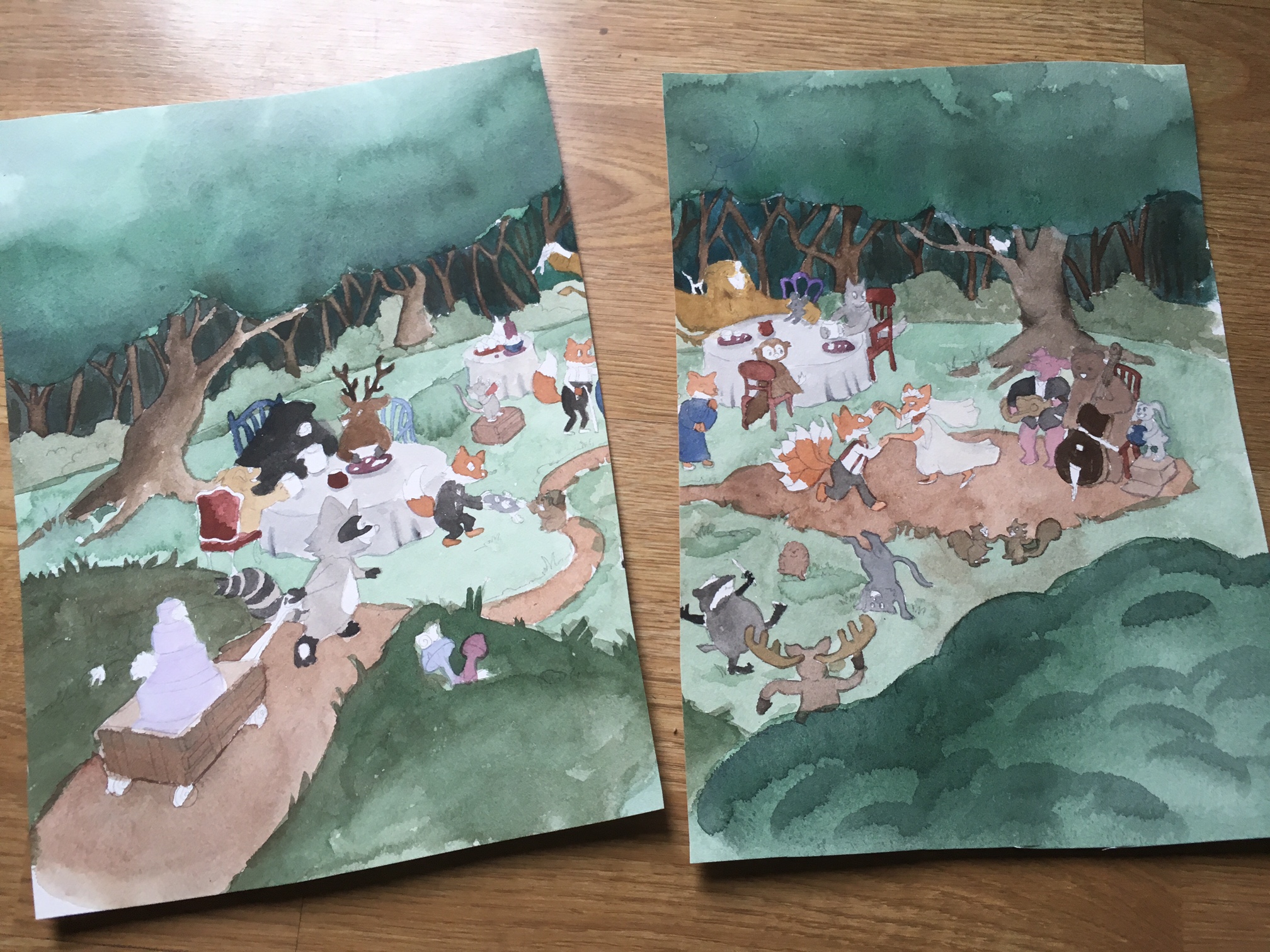
Once it was scanned into Photoshop, I “stitched” the image together using the clone stamp, which is my favorite Photoshop tool and deserves a medal. The clone stamp picks up whatever you want and “clones” it to a new location. It’s a beautiful thing.
Then I sat at my computer for twelve hours until my eyes went blurry. First, I messed around with the levels until my lighting looked great. I used the magic wand tool and took big chunks of areas, like the trees, and color corrected and darkened them. Then, starting in the lower left with the wedding cake raccoon, I zoomed in and just started finessing everything. I use Kyle’s brushes, which simulate watercolor brushes, to paint my line work (outline my shapes and characters). They are amazing, affordable, and you can find them here: https://www.kylebrush.com/. Since my painting is so sloppy, I’m often using the clone stamp to re-paint certain portions or correct where my watercolors have bled into the wrong areas. Then I popped the text in there! The very last step is adding any detailed highlights that I couldn’t do with watercolor paper – so putting in the string lights in the trees and the sparklers. Some traditional artists do this step by using masks or by applying white gouache. I like Photoshop.
And, well…that’s basically it. I’m in Photoshop for a VERY long time on a piece this large and detailed.
In the end, I’ve got a hybrid of traditional and digital media. Photoshop makes my job so much easier. I cannot even imagine doing illustrations 100% traditionally; I think I would pull my hair out in frustration. What do you do when the water spills all over your paper? When the watercolor paint bleeds into the wrong area? Do you start over?! Dude, no. Photoshop saves.
On the other hand, artwork created 100% digitally looks lifeless to me, at times. If you’re incredibly skilled and can make it look handmade, I’m sure I’ve been fooled plenty of times. But there’s just something about digital art that’s a bummer to me. So that’s why I found this process of marrying digital with traditional, so I still get the feeling of a watercolor painting, but with the precision and tidiness of a digital painting.
Alright, that’s it! If I can explain it to you guys, I think I’ll be fine with a bunch of Kindergartners on Friday. If you’re an illustrator, please share your process with me! And if you’re still curious, feel free to ask me any questions about my process. I’m sure it will evolve, but for now, I’m finding my style and process that works for me, and I’m happy to share.